Once in a great while there comes along a logo redesign so ingenious, so fresh, so inventive that those who witness it can only stare in awe and kick themselves for not coming up with it first. THIS is one of those logos redesigns.
Yep, EAT24 is changing our logo. Why? Because we just got married to Yelp, so we need to step up our game, refresh our look, and move away from our childish ways of the past. It’s time to get serious.
Wait, What?
You’re probably thinking to yourself, “Hey EAT24, your logo is beautiful. It’s the first thing Yelp noticed about you before they asked you out. Plus, you probably put a lot of time and effort into it. Why change it?”
Yes, we did put a lot of work into it. We spelled the word “EAT” and then added the numbers “2” and “4.”
Sure, It worked just fine for a while. But fine isn’t good enough. We need something better than fine. We need something perfect. We need something that makes us go to thesaurus.com and look up words like “splendiferous,” “examplary,” and “resplendent.”
How can we maximize our core competencies to drive results and turn influencers into brand evangelists? Organic reach. Streamlined. Curated. Words. With periods. So it seems more. Important.
The answer is obvious. Change the logo.
The process wasn’t easy. We explored every angle, ate every wing flavor, and used every designer in a 15-foot radius to come up with our new design… but first, a look at how we got there.
Research, Thinking & Stuff
Before we started rearranging pixels, we had to think. A lot. And we had to ask ourselves some serious questions. EAT24 is about food. But what do people want from their food? Is it thicker noodles? Extra wasabi? Self-rolling taquitos? What is the “core belief” of “food”? Then it hit us. Eating. You see, food is just calories your body uses as fuel. But eating… well that’s just so much more.
Eating is about being hungry. Being hungry sucks. Suckiness can be solved by food. Food is what we eat. Eating is everything. Eating is everywhere. Eating is a 24-hour responsibility. Eating is 24.
EAT24.
So, now that we’ve defined ourselves in a way that makes perfect sense and isn’t at all ridiculous, we can think about our new logo.
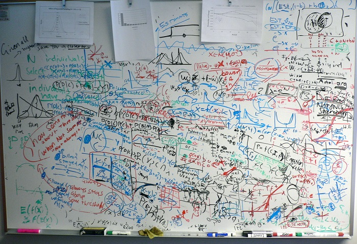
Before we started sketching, we needed to do our favorite thing – eat lunch. No wait, research. We had to find a symbol that conveyed eating and 24 that was all at once thought-provoking and instantly recognizable. So we went to the break room for inspiration.
During a two-week observation period we discovered the two most popular shapes of food eaten during lunch: circles and tubes. Here’s a breakdown of our data:
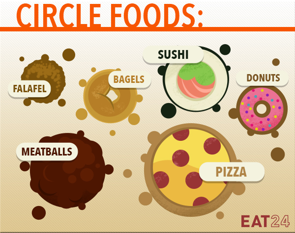
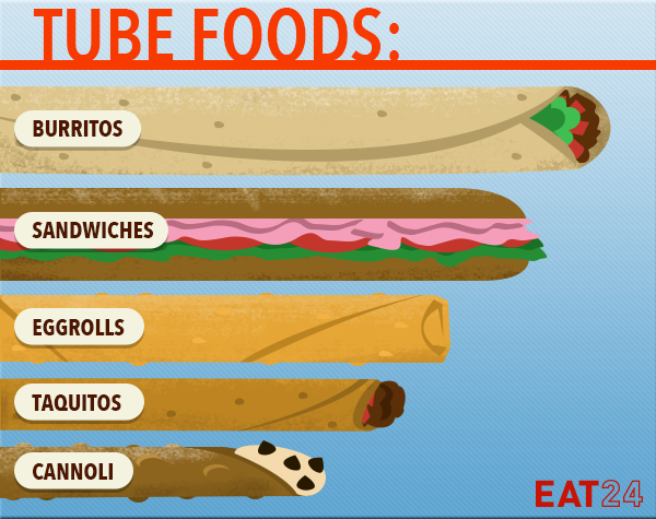
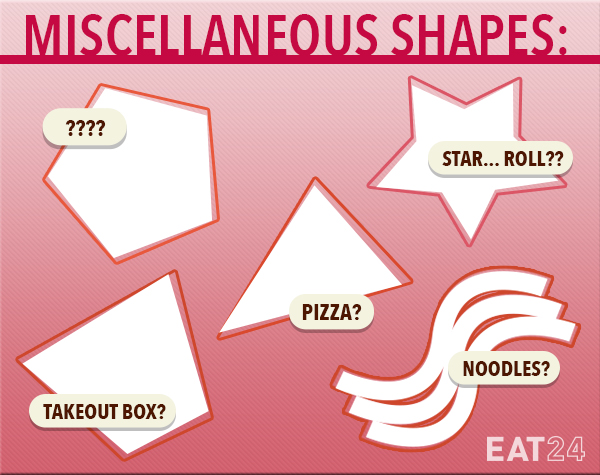
As you can see, with the exception of a few boxes and squiggles, circles and tubes were easily the most common. But how to use them? Let’s continue…
We had our shapes, now how do we incorporate them into a unified vision of eating and 24ing? Utilizing top-of-the-line gyroscopic engineering, well-fed designers, and several bottles of whisky, the exploration began.
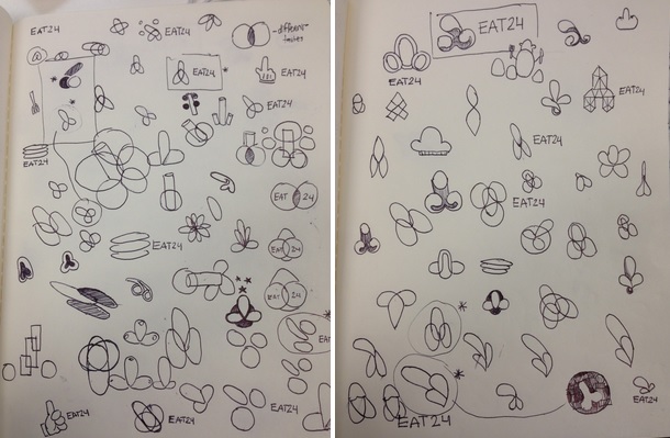
Finally, we found it. The precise arrangement of circles and a tube that represents our true brand identity.
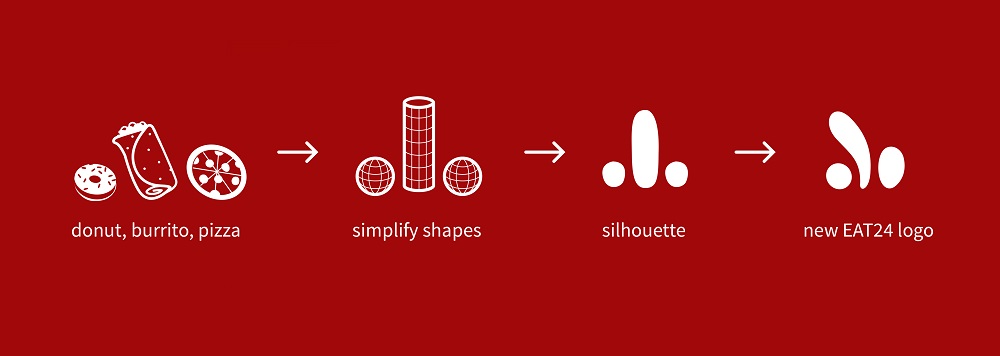
And now… without further ado, may we present the new EAT24 logo:
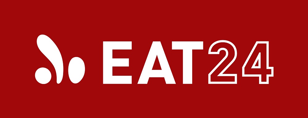
Never before has such a simple image said so much. It evokes feelings of community, shared experience, eating, 24ing, quietude, louditude, gyros, phalanx, toner cartridge, breathing, fish wallets. It’s a symbol that screams out, “Hey, you over there! Do you want a donut, burrito, and personal sized pizza? Great!”
OK that’s cool, but maybe we should change colors too… ?
Color Exploration
The classic EAT24 red has served us well, after all, red is the color most associated with hunger and food (take THAT blue!!!). So naturally, our first instinct was to explore a variety of reds and pinks. But since we’re 100% dedicated to our customers, without whom we would be nothing, we also wanted to consider some flesh tone hues to show the human side of our business.
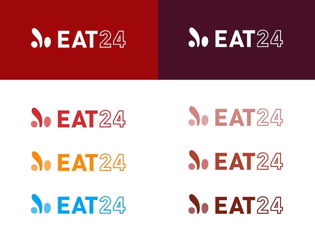
Ultimately we ended up with our classic red (the color that makes our butt look the firmest).
We are so thrilled with our new look and feel, and we just can’t wait to see what it looks like in the real world. In fact, here are a few visual approximations of New EAT24 in the wild:
It looks fantastic on a phone.
![]()
It looks huge on billboards.
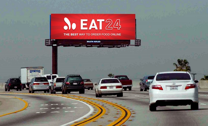
And in the sky!

If you want a copy of our new logo, we’ve provided you with (free!!) downloadable screenshots for your phone (iPhone and Android), desktop, and poster above your bed.
Oh, and just one more thing. The new EAT24 logo isn’t actually official yet. We need approval from the Yelp board (You know what they say, the couple who rebrands together, stays together). The Yelp Q1 shareholders meeting is taking place on Tuesday, March 31st, and that’s when they’ll decide if the new logo stays or goes. But we know they’ll do the right thing and greenlight it right away. Our new look could be live as soon as Wednesday!
In the meantime, show your support for the new EAT24 logo by sharing your thoughts with @Yelp and with @EAT24. We’ll even write a tweet for you:
Hey @Yelp, the new @EAT24 logo is amazeballs!
OK, we’re done here. Thanks for making it to the end of all these words, charts, circles, and tubes. We love you.
<3,
EAT24
*Are you here from the Weekend Coupon Email? Hi! That secret bonus coupon info you were looking for is right here. If you want another coupon, all you have to do is tweet this and we’ll love you back with another code: “Hey @Yelp, the new @EAT24 logo is amazeballs!”
Heh heh. Amazeballs is the word. And as someone once said, a dirty mind is a continual feast. LOVE.
This is the greatest logo ever, Beavis.
Please go back to writing about ad analytics in porn websites. Waayyyyy better than this one.
We love you more 😉
OK 🙂
Is it just me, or does it look like a certain body part?
Which part? The thumb?
Reinforces the #nopants hashtag I suppose.
Hey guy who would rather read porn blogs, get your mind out of the gutter! Keeping it classy @eat24, the new logo is aesthetically pleasing. Geometry is science
THANK YOU!!!!
Please Yelp, do not destroy a great product like Eat24. Do not leverage it so hard to try and make money that you ruin it like you’ve done with your ratings system.
The new logo is nice, albeit a bit phallic. 🙂
It looks like a penis. No porn or gutter mentality needed. Even my penis loving GF said the same thing when first viewing it. I mean I suppose it can work in my city (San Francisco) for everyone.
Semi flaccid penis, semi flaccid logo. There was nothing wrong with the original logo.
Love it
April Fools!!!!! Right? Please?!?!?!?!
April Fools FTW
I don’t like it. No dirty mind here, but it really does look like a penis. That’s a really bad message. You guys should consider removing it our replacing it.
“Our new look could go live as soon as Wednesday!”
*looks at calendar*
Oh hoho I see you Eat24, that’s a good one
OH gosh.. I hope that this is an April Fools joke…. and if I’m right in thinking it is… BRAVO!
All I could think in the image where they were sketching ideas is didn’t someone mention that ALL of the images looked like certain male genital!!
And the app logo… Looks like it just says EAT “d*ck” – hilarious.
Oh Eat 24. What would I do without you!
your new logo looks like a…well…ya know…
Yeah…um, it’s a little phallic for my, ah, taste. Someone in your brainstorming group needs to get laid. Nuff Said.
100% approval of the new logo. When can I get a T-shirt? Preferably a customized one with a stick figure person leaning over to lick the logo just like the ice cream sundae it obviously represents. I might even get on my knees for a sundae like that….
ROTFLMAO B-) Good one
“Hey @Yelp, the new @EAT24 logo is amazeballs!”
Reminds me of the credits for “Superbad.”
Is that long thing in the middle supposed to be a symbol for “amaze?” Because its clear what the other two things are.
GOSH DANGIT I WANTED IT TO BE REAL
(It goes live Wednesday. I.e. The day after the last day of March)
While some might call it morally objectionable, I applaud the fact that you’ve kept the peen and gotten rid of the pesky bear.
Never! Yelp makes us want to be a better person (app) 🙂
Cheers to U and your P-loving GF!
You’re right 🙂
Love YOU
When???
3/27?
Yikes!
Maybe the joke’s on us… we should probably stop brainstorming over margaritas!
What would WE do without you??
Sorry but I don’t like it. Remind me of a man’s private parts and that does NOT increase my appetite. No one in the office here liked it.
Go on…
You’re probably right 🙂
Well, that escalated quickly!
True. Its gotta be legit then. Love you guys!
And bonus code ‘tubes’ is amazetubes!
US TOO
Symbol for amaze? It is now!
Just glad I wasn’t the only one.to think so…that, coupled with the word “amazeballs”…well now….
Dramatically reduces the chances of it stealing your food.
Yikes!
Love You x 1,000,000!
Looks like a limp penis. FAIL
Doh!
Maybe you should put the new icon between the EAT and the 24? Just sayin.
There are few other tags as appropriate as “amazeballs”. That’s the most stimulating logo I’ve seen in the past 24 hours. Keep it up, gang.
it looks like a penis 🙁
Your new logo should totally have sex with the new AirBnB logo.
I would go to their massage parlor 🙂
Your move, Airbnb.
“Stimulating.” Nice 🙂
You’re right!
Someone needs to photoshop this ASAP!
I love a good April Fool’s joke as much as anyone else, but this is offensive. Why does a joke need to have a sexual or dirty reference in order to be found funny?
You used to be clever and very funny. I guess you became desperate… Ran out of material maybe?
I’m sorry, but I am officially done with eat24.
This just wasn’t necessary.
im gullible
EAT BNB!
I live for Eat24 copywriting.
I’m glad I’m not the only one who saw frank and beans.
my first was – hmmm, phallic. the Yelp board will never go for it. second thought was – don’t worry EAT24, the other one will drop soon. third? april fool. i see what you did there.
LOL!! This made my day! I love you guys @eat24:disqus , seriously, I look forward to the Friday emails not for just the coupons, but for the actual message. You guys are HILARIOUS! I first started to notice what everyone else is noticing when you guys got down to the “sketching” pics, and I was like, oh this is taking an uncomfortable turn. But what tickles me is all these people who are taking it SO SERIOUSLY!!! Keep up the great sense of humor and the fantastic work! I LOVE you guys! You guys are amaze-tubes-balls!
LOLOLOLOLOL
Very quickly. You had me at ice cream…
no no! please don’t stop! much more entertaining this way!
Well played, y’all. Well played.
This is why I look forward to checking my emails every Friday.
Are you accepting photoshopped mockeries of the new logo?
Oh, and “some flesh tone hues to show the human side of our business” . I died.
My favorite part of this is the people in the comments who actually bought it. Well played, you glorious bastards, it’s hard these days to land an April Fool’s trick!
The assemblage of apps around it…Silly Sausage…What to Expect Pregnancy app. Brilliance. Sheer brilliance. I applaud the Eat24 team.
Ummm that’s supposed to be male junk on the left…right? That IS intentional…right?
Looks like someone had a little too much fun with http://www.brobible.com/life/article/penised/
Hi Hanna, thanks for sharing your thoughts with us. We understand how you feel, and we just want to let you know that it was never our intention to offend you.
YOU are the most amaze-tubes-balls ever!! We love you Anna <3
🙂
YES!!! Please send, we can’t wait 🙂
High five!
Don’t forget Beyonce!
LMAO!!!!@!!!
If you were trying to go for a phallic logo, well done. Especially that pic of the sketch book. Looooooots of penis scribbles is what I saw. This is an April Fools joke right? LOL!
You’d be a proud MEMBER of this group: http://www.boredpanda.com/worst-logo-fails-ever/
This is the most brilliant thing I’ve seen in a long time. Can’t wait to see it Wednesday!
Phalic Foods.. nice lol
Can’t be any worse than Airbnb’s logo. Maybe that can be a match made in genitalia heaven…
Dear social media coordinator that is responding to all of these comments:
You. are. amazing.
No YOU 😉
Scroll down a bit… an amazing person of the Internet gifted us with this
Us too!
Oh wow, this is amazing. Thanks for the laugh guys/gals!
Wait whaaaaaaaaaaat?
We can’t help it! The people have spoken, and they love circles and tubes!
Thanks for the dick joke.
Anytime 🙂
You can let your team know that this strategy worked perfectly. I had never heard of eat24, my friend shared this article on Facebook, I clicked, I lol’ed, and now I will be using your service.
Oh well that is so not fair. I take 45 glorious minutes to read this. I laughed, I cried, I peed my pants, but ALAS poor Yorick, I do not “tweet”. So, and I’m cryin’ while saying this. I miss you my coupon of love. How jilted I feel that you will not benefit my order because I am tweetless. Le siiiigh.
We love you with our without tweets! Use bonus coupon code ‘tubes’ and please accept our apology for the crying and peeing.
Yay. Guilt and bodily fluids always work.
Your writers need a raise. For reals.
This comment was TOTALLY NOT WRITTEN BY EAT24 WRITERS. Pinky-swears.
i cannot be the only one who thinks it looks like a dick.
not that there’s anything wrong with that…
…
…
This is why I love you guys! Well, this and you bring the food to me so I don’t have to bring the pants to the on position ^.^
I’m so sorry, but the new logo looks like one of two things: male genitalia (I can see that others have said the same thing already), or a crude cartoonlike rendition of someone’s hand as it flips a big ol’ bird (hopefully not to Yelp, since y’all are getting into bed with them now! lol). Honestly, the original logo was already short, sweet, and to the point. For me, that little design is superfluous and distracting, to say the least. I’m actually wondering if this is all some weird joke that I’m just not getting…
🙂
what if you dont use the twitter machine?
I look forward to my Eat24 email all week, incredible entertainment! And I took this one a little too seriously – between the teeny tiny heart attack and the forehead smacking, I’m exhausted. Thank you!!
That is a very graceful tube.
Looks like a penis
We thought so too!
Anytime 🙂
That’s OK, we can still give you code ‘tubes’ because we love you 🙂
We like how you think 🙂
Down with pants!
I agree, first thing I though of………….. grubhub here I come. Bye Bye eat 24
Beat to the punch… of course the pun was intended.
It just looks like a dick and balls beside your old logo…
Can’t wait to feed you!
i was about to fall asleep at my desk and then i decided to read your email. great decision. thanks for this 🙂 keep up the hard work!
Just sayin, looks incredibly phallic!
You’re welcome but also we’re sorry to keep you from your nap 🙂
Not only does this new logo make me hungry, but it also makes me horny, so there’s that.
Amazeballs… maybe. New logo definitely brings to mind the latter half of the word, as well my sentiment upon longing for some decent delivery options in my area. IT people often require foodstuffs to come to them… we’d love to use your entertaining app for the other restaurants in our area, but not yet listed. I’m thinking I’d appreciate the logo more if I could declare “amazeballs” to the awesome variety eat24 has to offer!
please help- I will pay you $10 right now if you get Uncle Peteza’s, Pagliacci, and the new Greek gyro shop in Canyon Park on board. I’ll even blast a promotion to all of the interwebs!
Amazeballs is kind of an unfortunate way of putting it under the circumstances, isn’t it?
I wish the whole internet was like this.
looks like you are giving the finger… or a dick. but I’ll still order food from you.
Guessing the genitalia logo is a joke, but your “new look” e-mails are all messed up… Text no longer justifies right border, and info paragraph with expiration date, etc. no longer appears. Just lots of big, empty space to the bottom.
We’ve missed you, fartballoons <3
that was my first impression
it kinda looks like an abstract testicles and erect penis, but then again its always something on my menu. 😉
You are so right! We’ll do our best to sign up those restaurants, but it takes two to tango, so if you want to put in a good word for us that’d be cool too 🙂
Us too.
Is it?
And we’ll still feed you 🙂
That’s really weird. Would you mind forwarding one of the messed up emails to media@eat24.com so we can take a look?
🙂
It looks like a limp weenie w 2 tiny balls. Yukky – stick w what you’ve got or improve. This “update” sucks wind!!! Really, you all missed th phallic (sorta) symbol? Argh! Get new designers!!!
Yeah, I like it. Very cool!
lol, I hope this is already 1st April joke 🙂
Kinda sorta. Might be a good idea to avoid anything with “balls” in it. 😉
I like the logo! All these April fools calling it an April fool’s joke! HA! It’s not April, fools! I don’t know why people are seeing penises on this. It makes absolutely no sense to me. I see a floral print, lava lamps, movement, Ketchup squirts, fields of wheat blowing in the wind. But not a penis, only in the genitalia oriented brainstorming session (which of course has to do with the enormously sexually charged atmosphere in the room, boy if Freud were alive haha,ohh, he’d have a laugh) Keep it. Let them laugh and grab their crotches! KEEP IT!
If you have a logo that lasts longer than four hours, please see your doctor.
wow what a dick logo
go home, eat24, you’re drunk. and horny. and please deliver a pizza when you wake up.
go home, eat24, you’re drunk. and horny. and please deliver a pizza when you wake up.
This is the best long form dick joke since the season finale of Silicon Valley..
I’m sorry but, with the distinctly penile appearance of the proposed new logo I just cannot tweet that it is, “amazeballs” even for another weekend coupon. Maybe back to the drawing board?
Sooo, what was the code?
Perfect! Now Eat my 24 inch logo.
First thing that came to mind seeing it was “Penis a la Stop & Shop?!?”
http://img1.wikia.nocookie.net/__cb20120222014822/logopedia/images/f/f1/Stop-and-shop-logo2.jpg
lol penis joke
The bonus code is ‘tubes’ 🙂
Fair enough! We would still love to give you bonus code ‘tubes’ for telling us how you feel 🙂
OK 🙂
We love what you see. Lava lamps FTW!
Thanks for the feedback 🙂
ahem…
penis! penis! penis! penis! penis! penis! penis! penis! penis! penis! penis! penis! penis! penis! penis! penis! penis! penis! penis! penis! penis! penis! penis! penis! penis! penis! penis! penis! penis! penis! penis! penis! penis! penis! penis! penis! penis! penis! penis! penis! penis! penis!
penis.
On a serious note, fuq Yelp. Sad to hear you’ve been bought out by Satan.
Very sweet. I’ll order tomorrow! (I’ll ALWAYS order, no matter what your logo looks like!)
You should have held on to your new logo for three days to avoid premature vociferation.
The only way this could have been made better was to rearrange the order of the elements so it would read EAT, then Logomark, then the number followed by a /7. So glad you guys don’t have an HR department, or if you do — at least they have a sense of humor. I don’t think anything this funny would have made it out of Apple, Google, Facebook etc.
So…are we gonna ignore the fact that the new logo kinda looks like a penis..or is it just me?
http://i.imgur.com/6tjaHnA.gif
Looooooool
Nope, everyone seems to be on your side 🙂
Great suggestion. Maybe for the next redesign!
8=======D
We understand the way you feel, but Yelp has done nothing but good things for us, and our partnership has led to an even better experience for our customers. Only way from here is up!
I love you guys for responding to almost every comment. You are the real MVP.
No YOU 😉
I think you should reposition the word “eat” on top of the new logo for the app photo. I’m sure it’ll get a lot more downloads that way!!!
Thanks again for the coupon. Enjoying chourico wontons and fried rice!
*giggles like a 12 year old boy*
Jesus Christ! This is the most cutesy and unprofessional website I’ve ever experienced. Except for maybe Hello Kitty or My Little Pony. Is that where the staff at this place came from?
EAT D*CK? And I want to order food from these people? I think not. They can EAT SH*T. I have a sense of humor, but my 15 year old won’t be using this site again for sure.
Wow! Yanked from EAT24 in a nanosecond. How’s this? U R THU BEHTS! LOL
BTW, I don’t see the promised coupon
nice. and I want food from you?
are you a 14 year old?
thanks, butthead. When does beavis show up
And if they can’t, at least there’s a pill for that 😀
We’re confused, do you want us to eat shit or give you a coupon?
Hey Jim, thanks for sharing your thoughts with us!
Who was yanked? What happened? We’d love to help you out…
I agree, it is a real company and they took penis as the sygnet? : )
Jeeeze
Why wouldnt you want to EAT D*UCK. Duck is delicious.
lmfao you’re logo looks like a d*ck xD It looks like you guys are telling people to go “EAT a d•ck” or “EAT24 d•cks!” Lmfao and you’re tweet xD I can’t even rn “[…] amazeballs!” LMFAO Oh my god my sides xD
Sorry not sorry 😉
Great, a limp dick logo for a limp dick company. How appropriate.
hello everyone here,my name is Albert Sunny am from Germany, i want to share a testimony on how Dr Osifo herbal mixture saves me from shame and disgrace, my penis was a big problem to me as the size was really so embarrassing , a full grown man like me having 4 inches penis and to worsen it i don’t last in sex i cant even last two minutes it was really a thing of shame my wife was really tired of me because my sex life was very poor , she never enjoyed sex, i was always thinking and searching for solutions everywhere until i saw a testimony of how Dr Osifo herbal mixture have been helping people so i decided to give him a try and to my greatest surprise in less than one weeks of taking the herbs my penis grow to 8 inches i couldn’t believe my eyes all thanks to Dr Osifo herbal mixture you can contact him on(drosifoherbalcenter@gmail.com ) or ( drosifoherbalcenter@hotmail.com ) or call +2348074876448.
Yep, EAT24 is changing our logo. Why? Because we just got married to Yelp, so we need to step up our game, refresh our look, and move away from our childish ways of the past. It’s time to get serious.
Didn’t anyone from your creative team see this 🙁
always a penis, never a vagina
“Hey EAT24, your logo is beautiful. It’s the first thing Yelp noticed about you before they asked you out. Plus, you probably put a lot of time and effort into it. Why change it?”